As Event Designers & Producers, we often deep-dive into a brand so we can bring it to life via a live experience. We love getting to know brands and using what we learn to think creatively and strategically around their goals — it’s our happy place!
When we began working with Klarna in early 2018 we were giddy at the prospect of playing in their somewhat bizarre, definitely quirky, and mysteriously sexy brand sandbox.
We at Sequence have been internally working to communicate our brand voice and style more clearly, and when we found Klarna’s brand site the simple, confident and crystal clear way they expressed what they do, how they look and how they talk made it infinitely easier and more fun to learn about them. We found ourselves referencing their branding site not only in our Klarna event strategy meetings, but also in our SEQ marketing meetings.

It wasn’t long before we realized we had it bad. We had a brand crush on Klarna and it’s only gotten stronger (shhhh don’t tell them, ok?!).
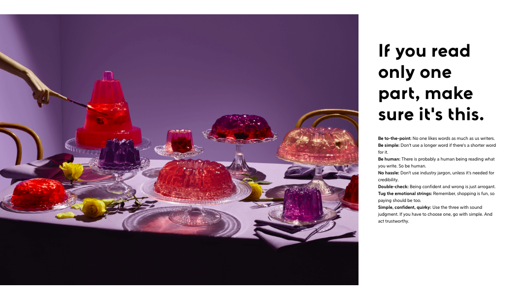
Klarna is a financial services company, but you would never know it. No dark and dingy teller windows here. Klarna is made for ecommerce and geared towards the millennial shopper with a playful 70s-chic color scheme and outrageous brand videos. I mean, what the heck does a swimming dog have to do with online shopping? Honestly, it doesn’t even matter.
Klarna’s brand isn’t just exciting and different, but it is clear and concise. Here's what you need to know:


